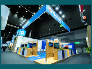
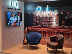
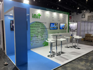
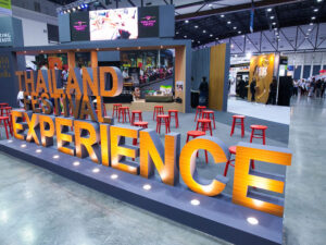
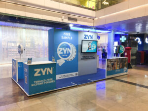
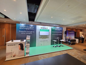
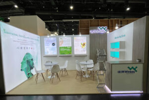
You’ve analyzed the floor plan and secured your spot. The logistics are underway. Now comes the moment of truth: what will attendees actually see when they walk down your aisle?
A trade show floor is an intensely competitive environment. You are surrounded by hundreds of other companies, all fighting for the same limited pool of attention. Research shows that you have roughly three seconds to capture a passing attendee’s eye and communicate exactly who you are and what you do.
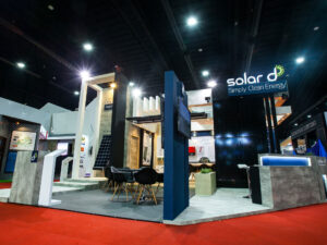
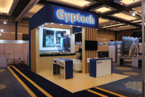
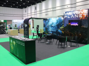
As an experienced exhibition stand builder, Fret Free Exhibitions approaches every stand as more than simply a display booth. Think of it as a temporary, high-impact storefront: it must be inviting, instantly understandable, and perfectly aligned with your corporate identity.
If you’re still deciding where your stand should be positioned, our guide to choosing the perfect trade show floor space explains how location, footfall and surrounding features can influence your results.
Here is the psychology behind creating an unforgettable brand experience on the show floor.
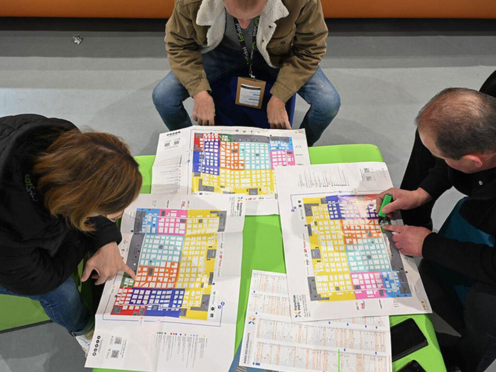
1. The Three-Second Rule: Visual Hierarchy and Messaging
When attendees walk the aisles, they are scanning. If your stand features a wall of tiny text, they will walk right past it. The human brain prioritizes information hierarchically; your design must do the same.
• The High Level (Brand): Your logo and core branding must be visible from a distance, placed as high as the show regulations allow if possible. This acts as your beacon across the hall.
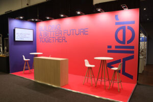
• The Eye Level (The “Hook”): At roughly 5 to 6 feet high, you need a single, punchy headline. Do not list every service you offer. State the primary problem you solve in six words or less.
• The Engagement Level (Action): Desk height and below is for detailed interaction—brochures, product samples, or digital tablets for deeper reading once the attendee has stopped.
2. Master the Flow: Sightlines and Open Architecture
Have you ever walked past a booth where the staff are hidden behind a massive desk at the front edge of the carpet? That is a barrier to entry.
Open architecture invites traffic. You want attendees to step onto your carpet almost by accident, without feeling like they have crossed a formidable threshold.
• Sightlines: Keep the perimeter of your stand low. If you have tall walls or storage closets, push them to the back or the shared walls of your space. Ensure that someone walking down the aisle can see straight through to your product demonstrations or screens.
• The Psychology of Flooring: A simple change in flooring (like a raised floor or a plush carpet that contrasts with the aisles) psychologically signals to attendees that they have entered a premium space.
3. Bespoke vs. Modular: Choosing Your Weapon
The physical structure of your stand dictates both its impact and your budget. Exhibitors generally choose between two primary build styles.
| Feature | Bespoke (Custom Build) | Modular (System Build) |
|---|---|---|
Visual Impact | Limitless. Can feature complex curves, unique shapes, and heavy custom fabrication. | Clean, modern, and highly professional, but constrained by the framework’s |
Cost | Higher initial capital. Single-use materials are more expensive. | Lower cost-per-show. The framework is rented or reused; you only pay for new graphics. |
Sustainability | Traditionally lower (often requires throwing away timber), though eco-friendly materials are improving. | Highly sustainable. The aluminum frames are reused for years across hundreds of shows. |
Scalability | Fixed to the specific floor space size it was designed for. | Easily scalable. Can be expanded from a 3x3m to a 6x6m by adding extra frame pieces. |
The Fret-Free Approach: We don’t believe in one-size-fits-all. We evaluate your goals and budget before making a recommendation. Often, we utilize a hybrid approach—using sustainable, cost-effective modular frames for the structural walls, and attaching bespoke fabricated elements (like custom illuminated logos or unique product displays) to give it a fully custom feel without the custom price tag.
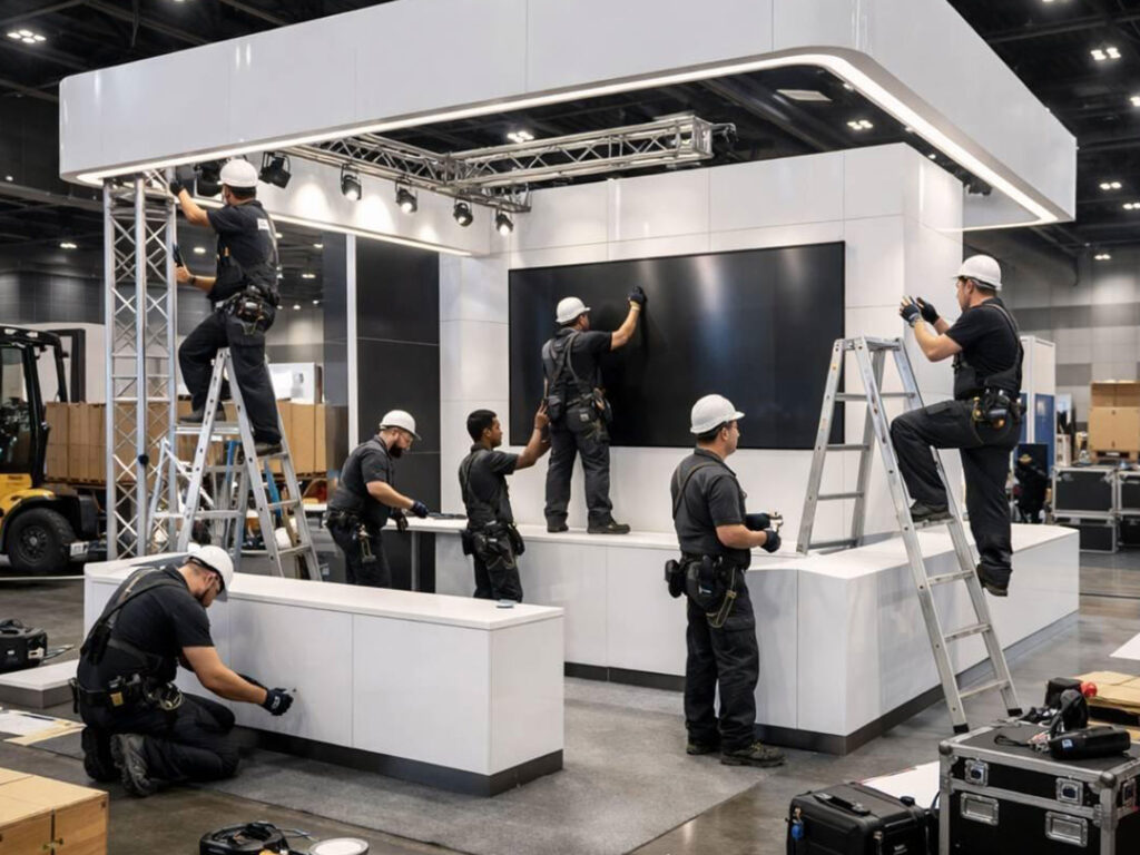
4. Lighting: The Unsung Hero of Stand Design
You can spend thousands on stunning graphics, but if they aren’t properly lit, they will look muddy and unprofessional. Lighting is the most cost-effective way to make a stand look premium.
• Ambient vs. Accent: Venues provide dull, flat ambient light. Your stand needs dedicated spotlights to make your graphics pop and your products shine.
• Color Temperature: Ensure your lighting matches your brand vibe. Tech companies often use cool white light (resembling daylight) to look sharp and modern, while hospitality or lifestyle brands might use warm white light to feel cozy and inviting.
• LED Accents: Incorporating LED strip lighting under counters, around the edges of signs, or within the flooring adds a high-end, futuristic finish that naturally draws the eye.
Key Takeaway: Form Must Follow Function
Your stand is a tool designed to do a job. Before you approve a design because it looks “cool,” ensure it effectively communicates your brand within three seconds, invites attendees in, and physically supports the goals you set at the beginning of the planning process.
Great stand design also depends on everything behind the scenes working smoothly. Our guide to exhibition planning and logistics covers the operational side of exhibiting, from venue requirements and freight to installation and show-day preparation.
If you’re starting from the beginning, read our complete trade show planning guide for a step-by-step overview of planning a successful exhibition.
Ready to explore sustainable exhibiting in Chapter 5?